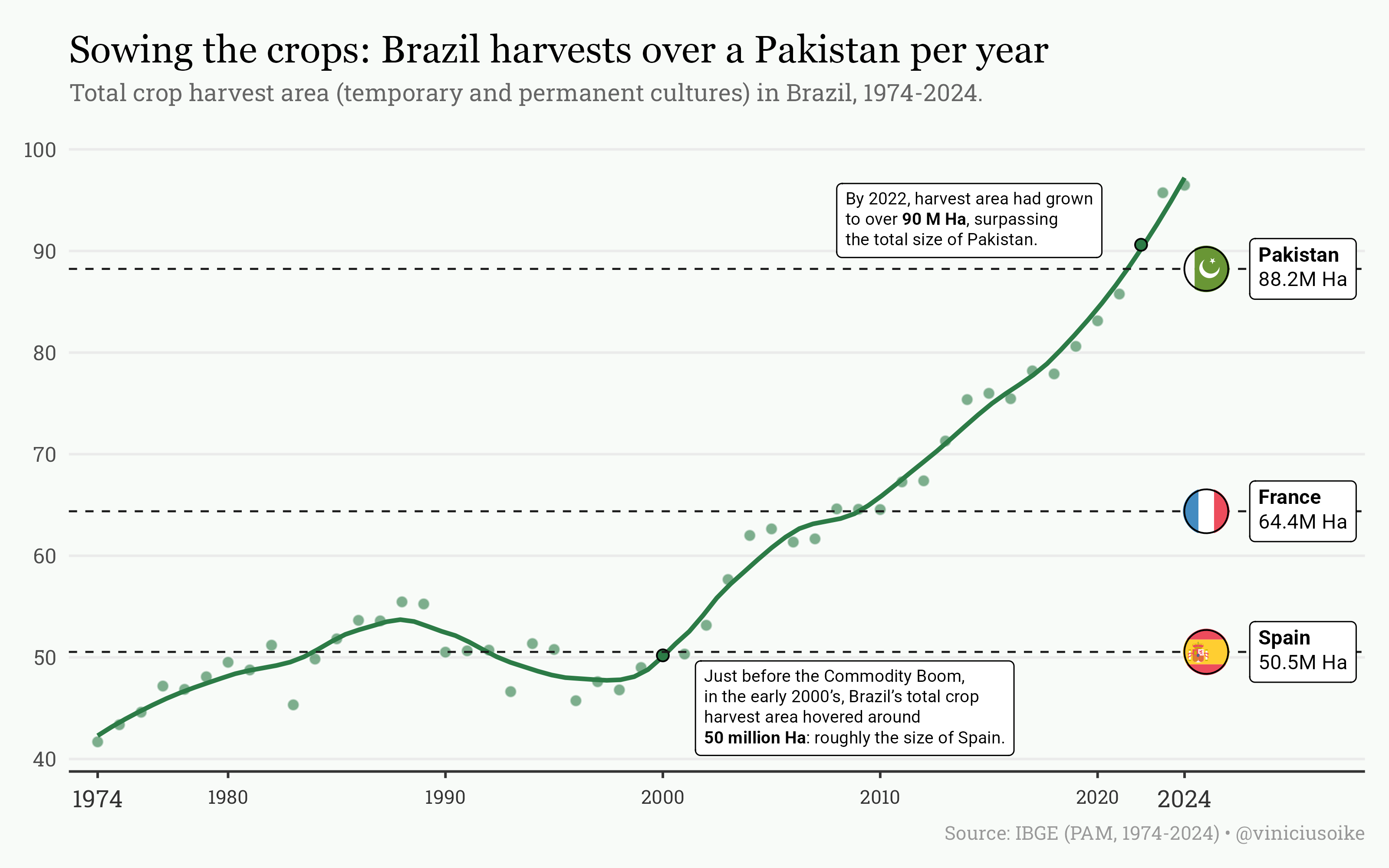
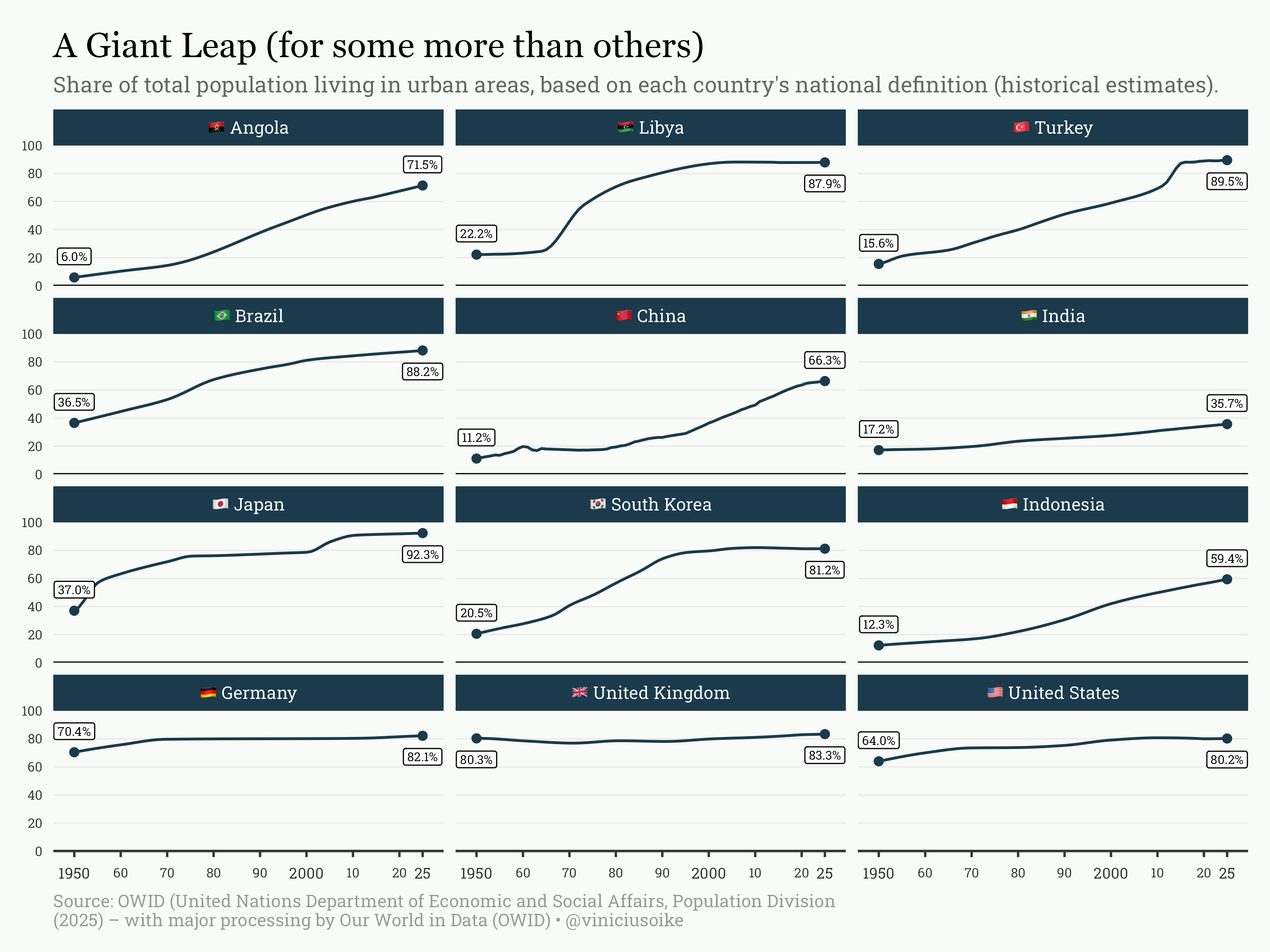
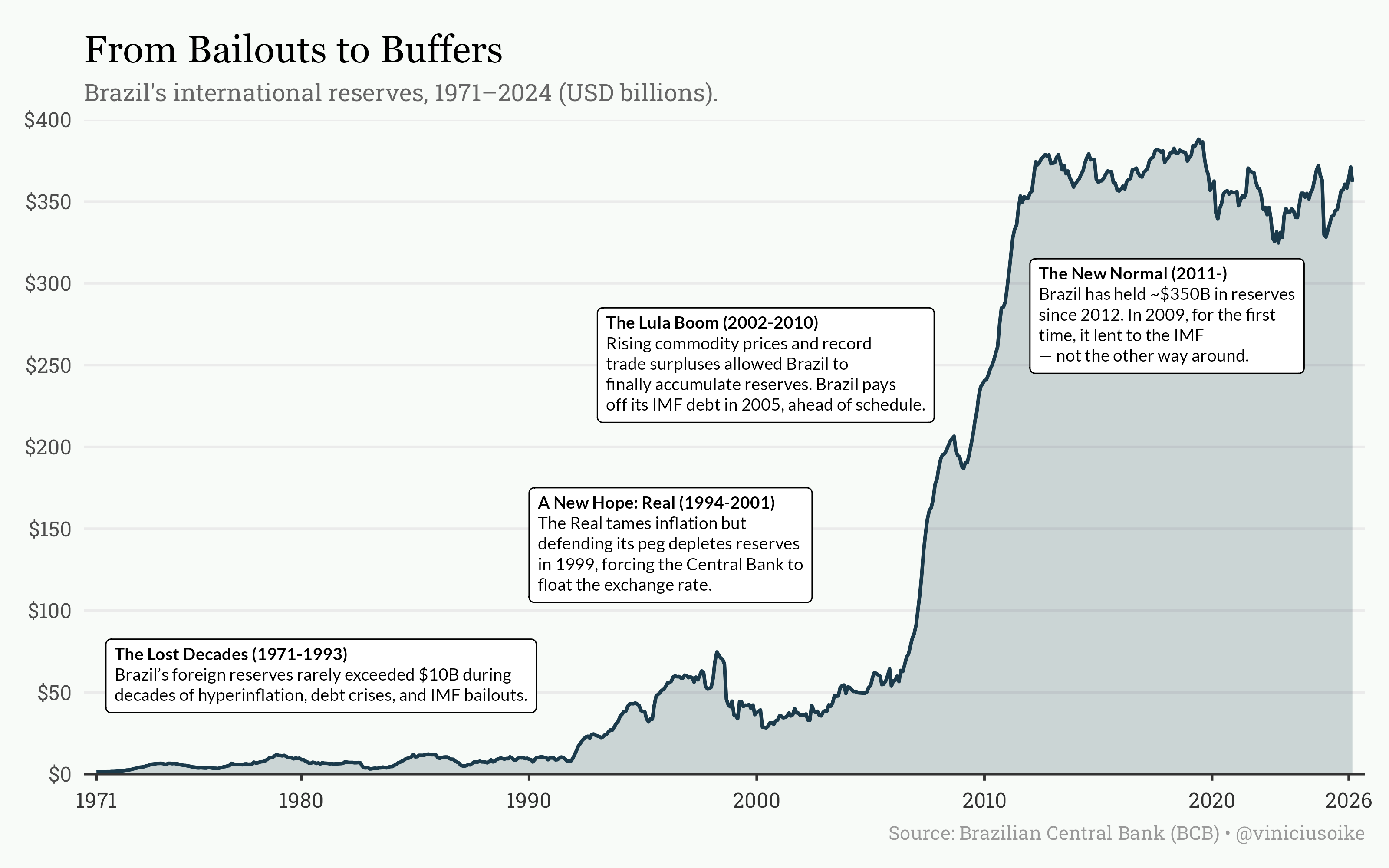
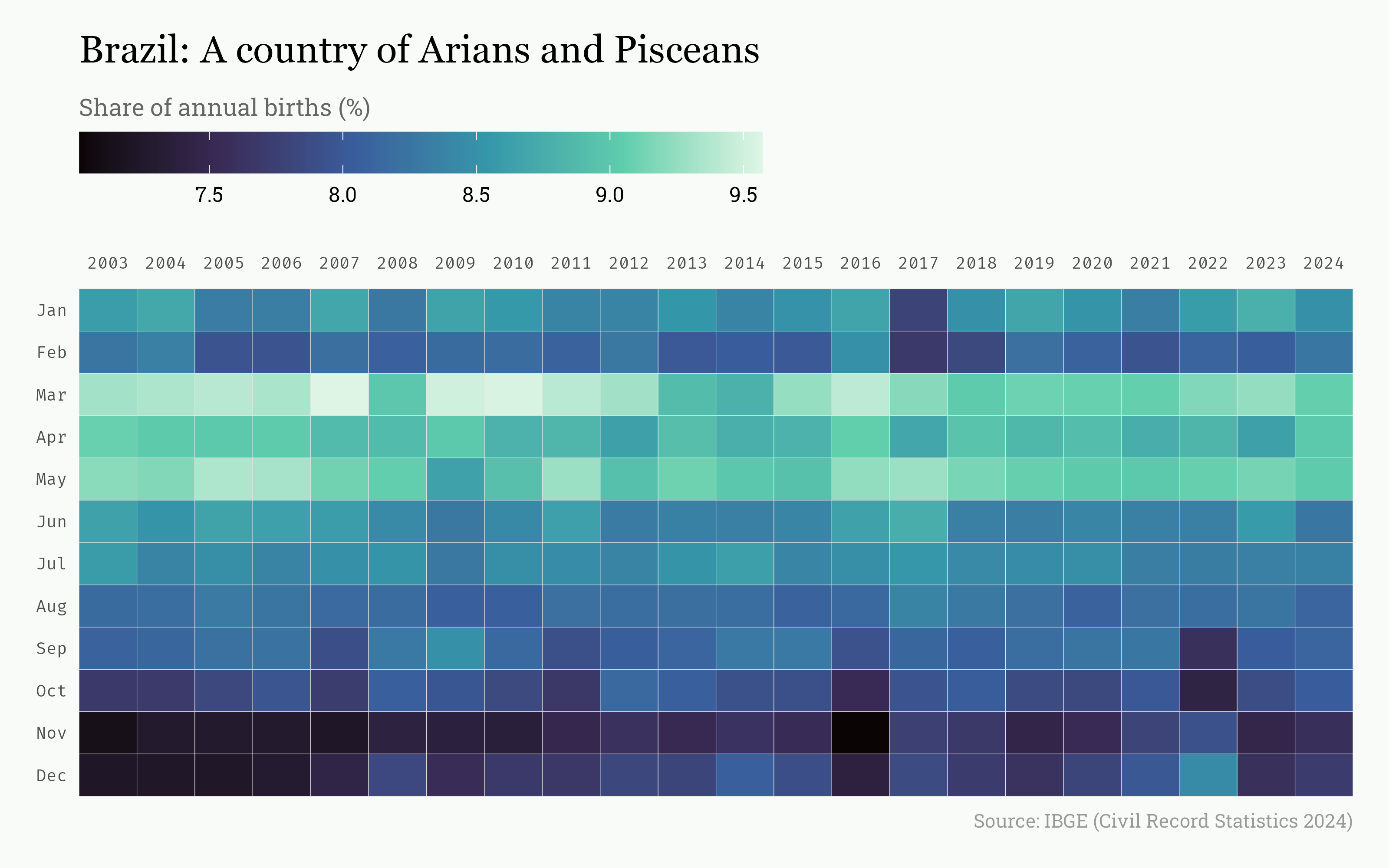
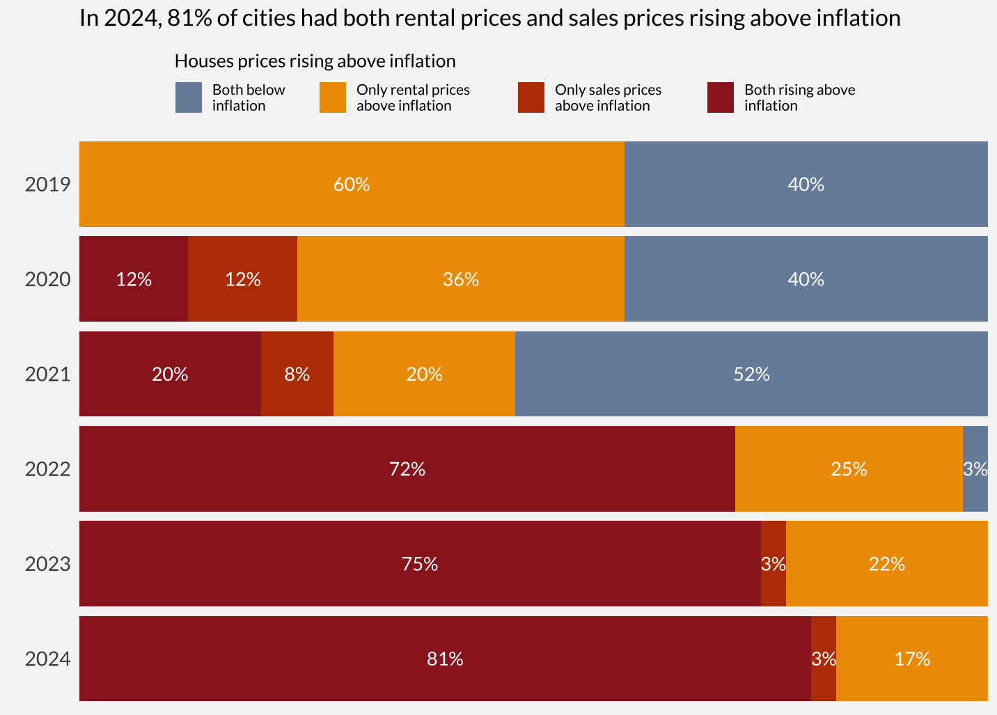
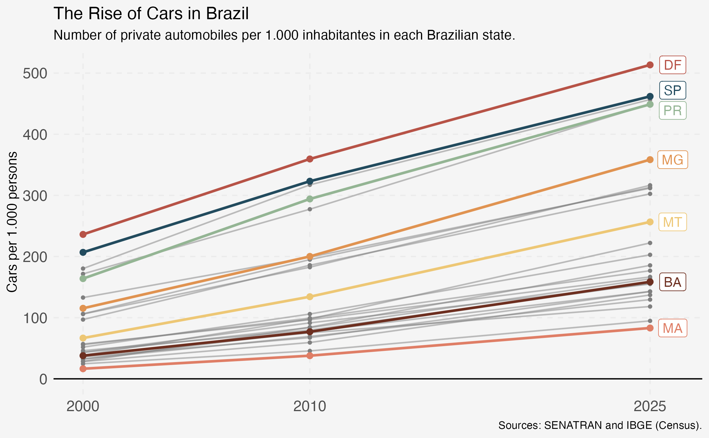
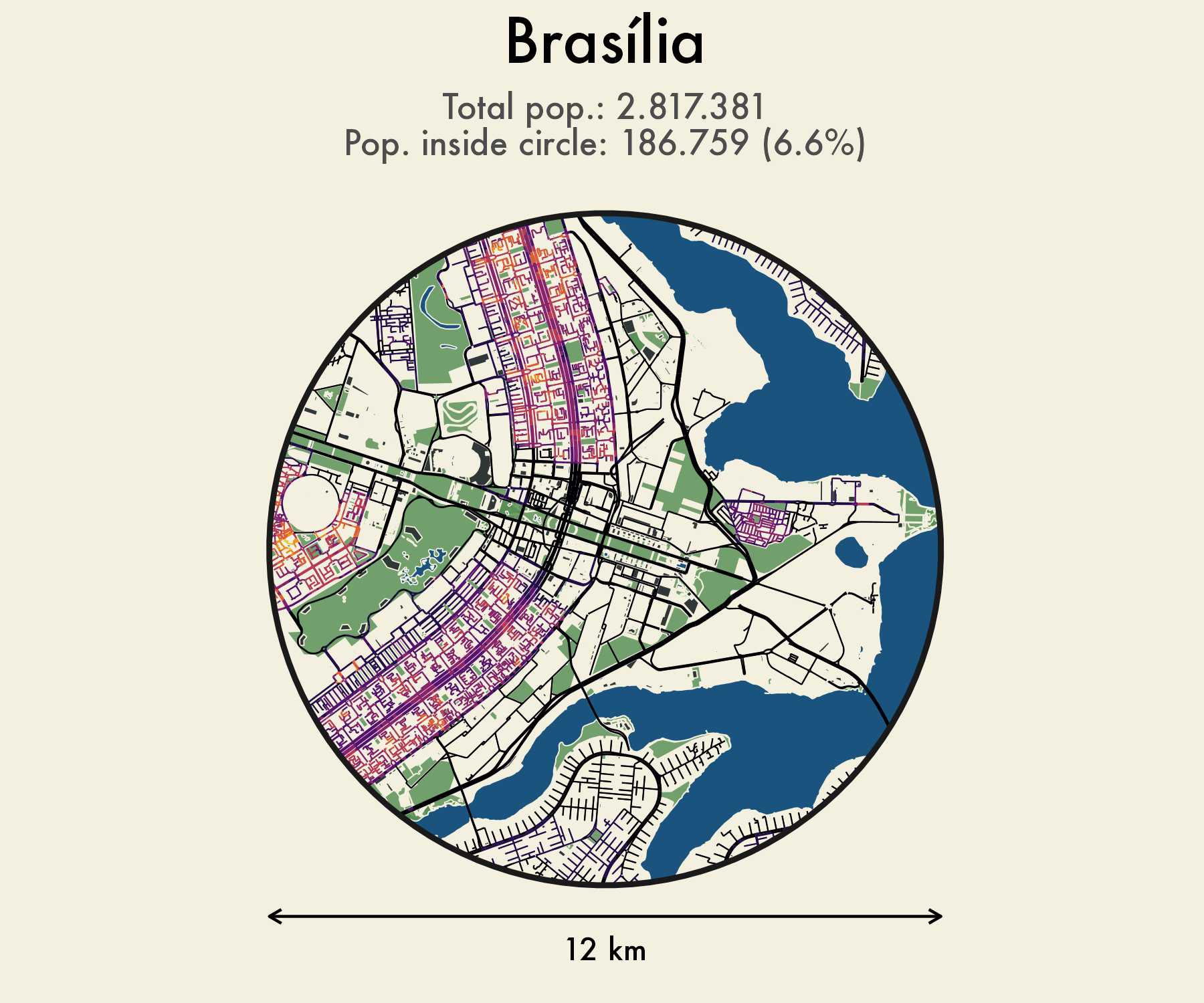
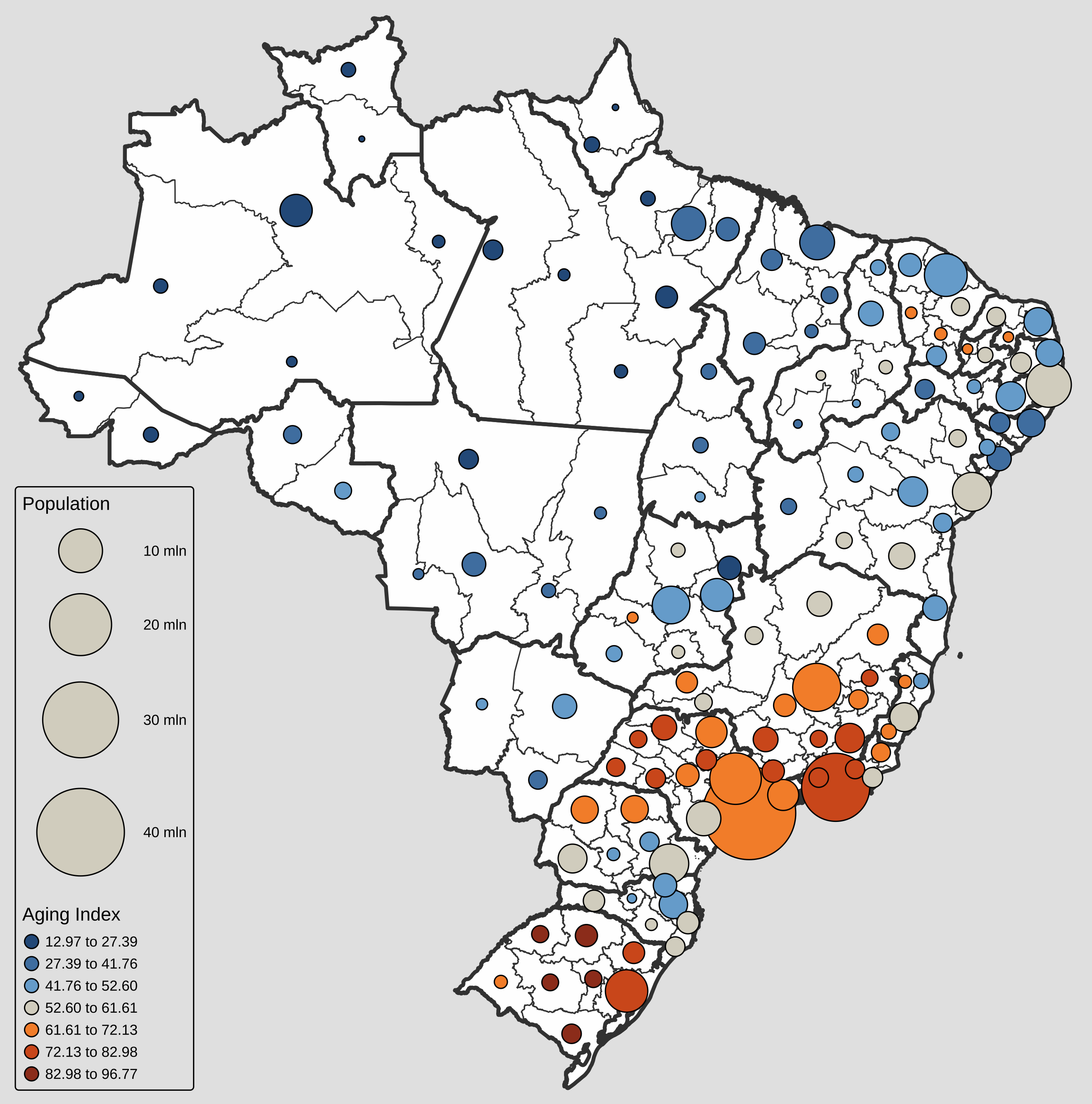
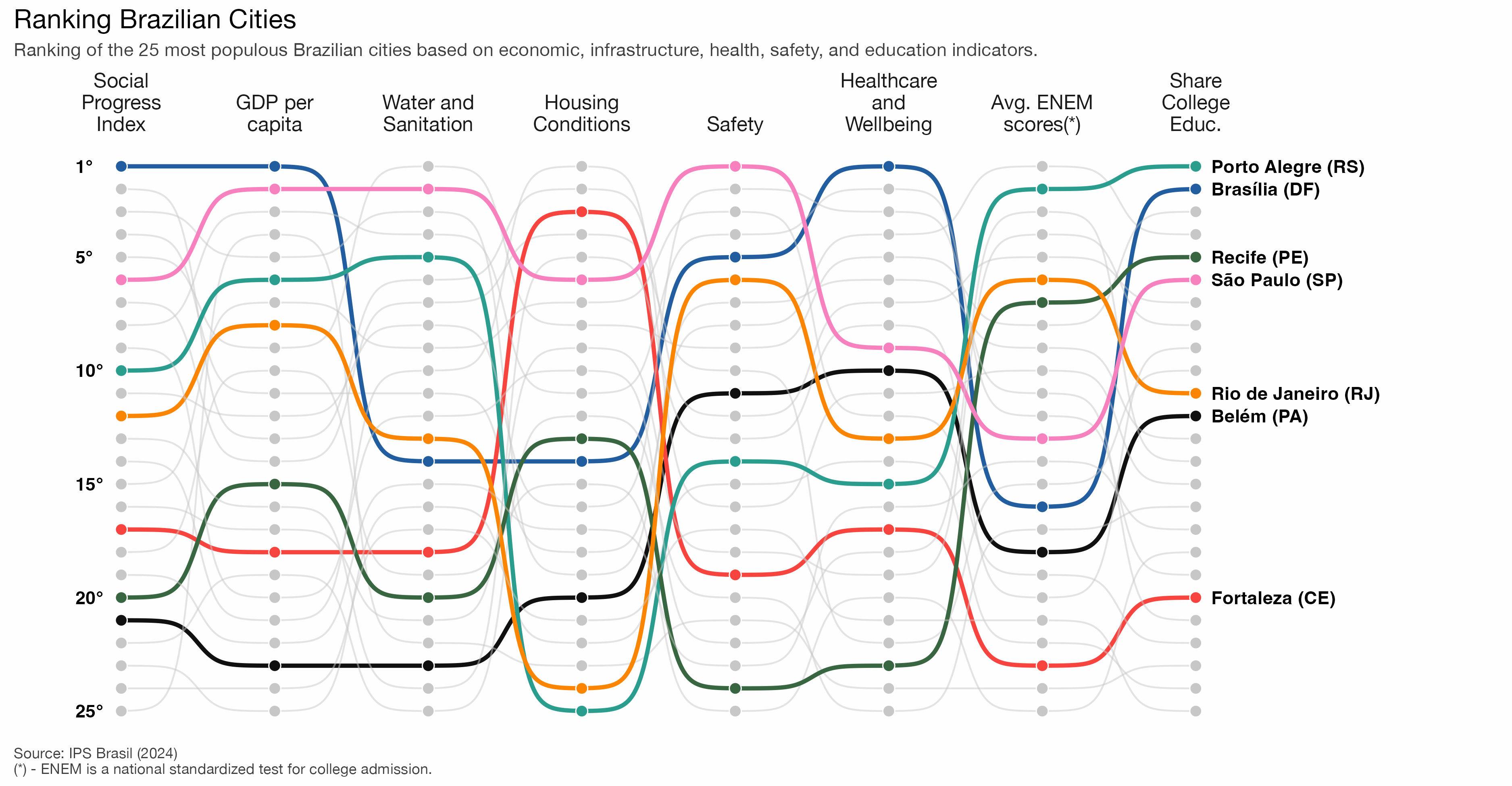
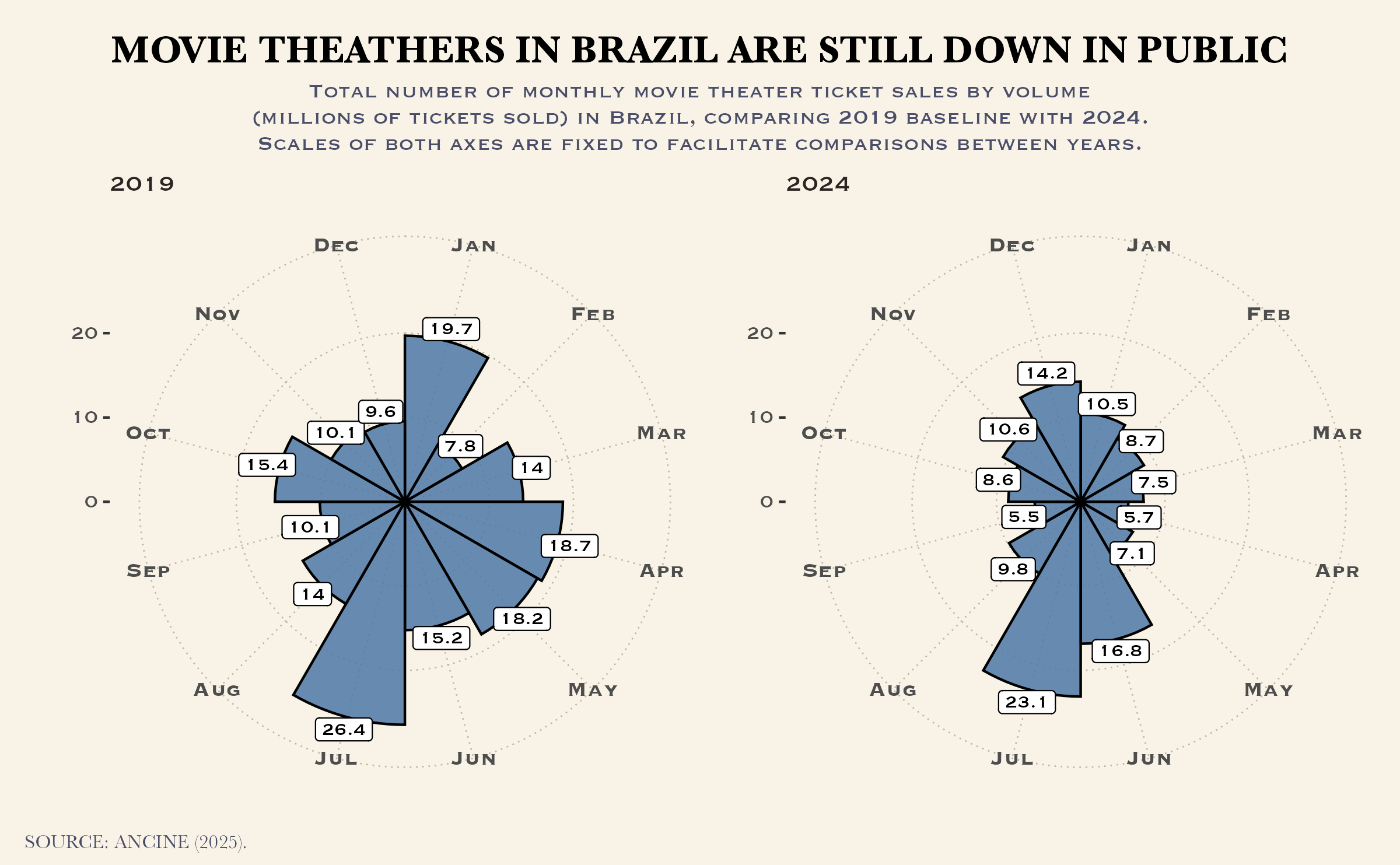
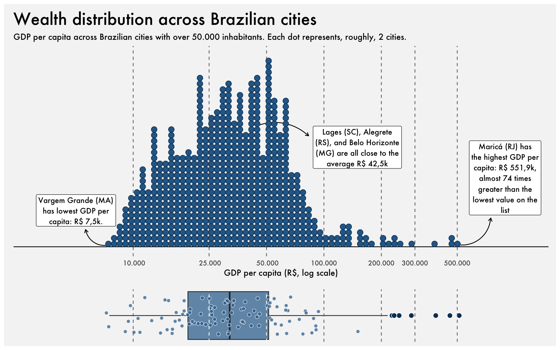
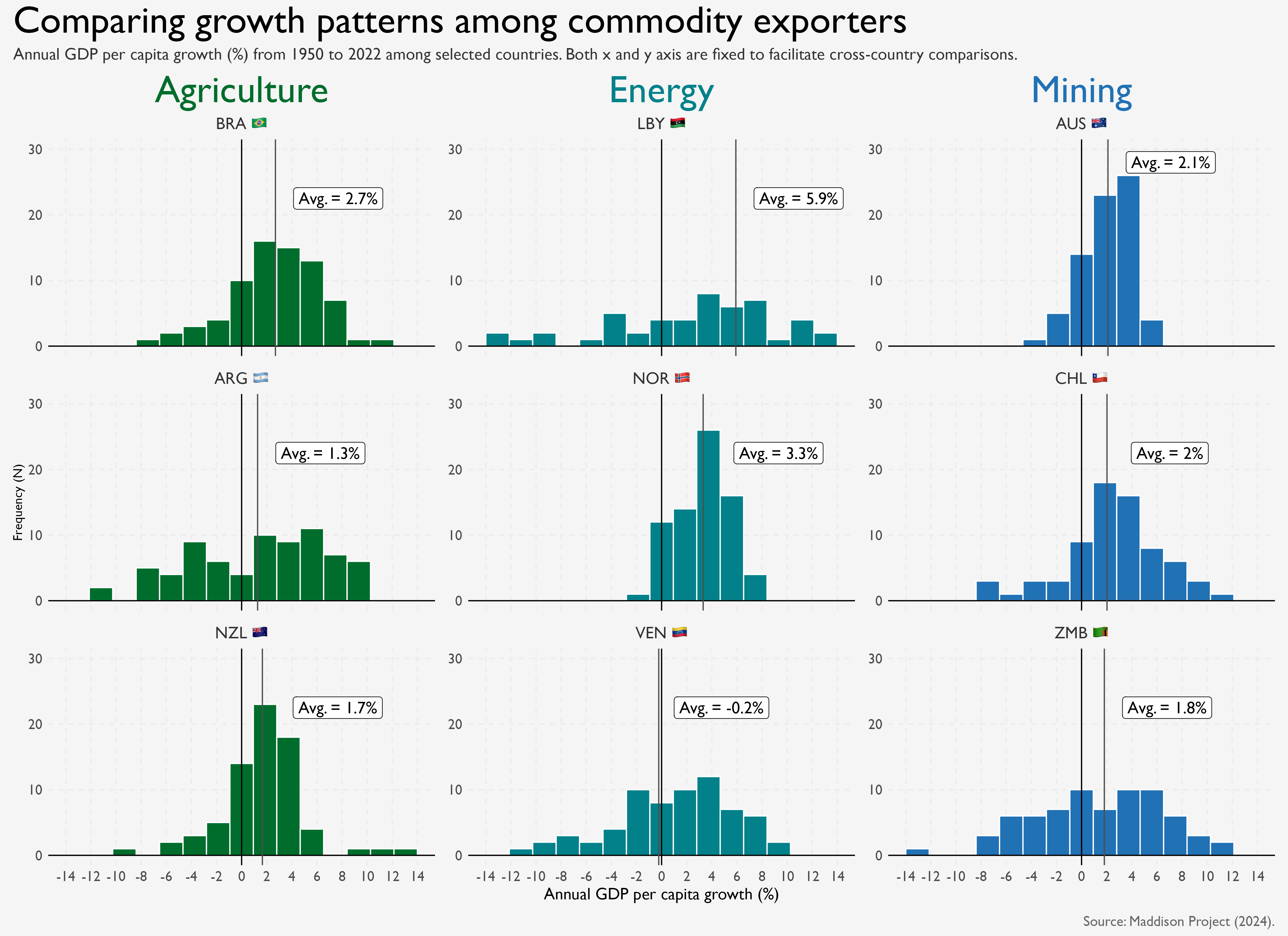
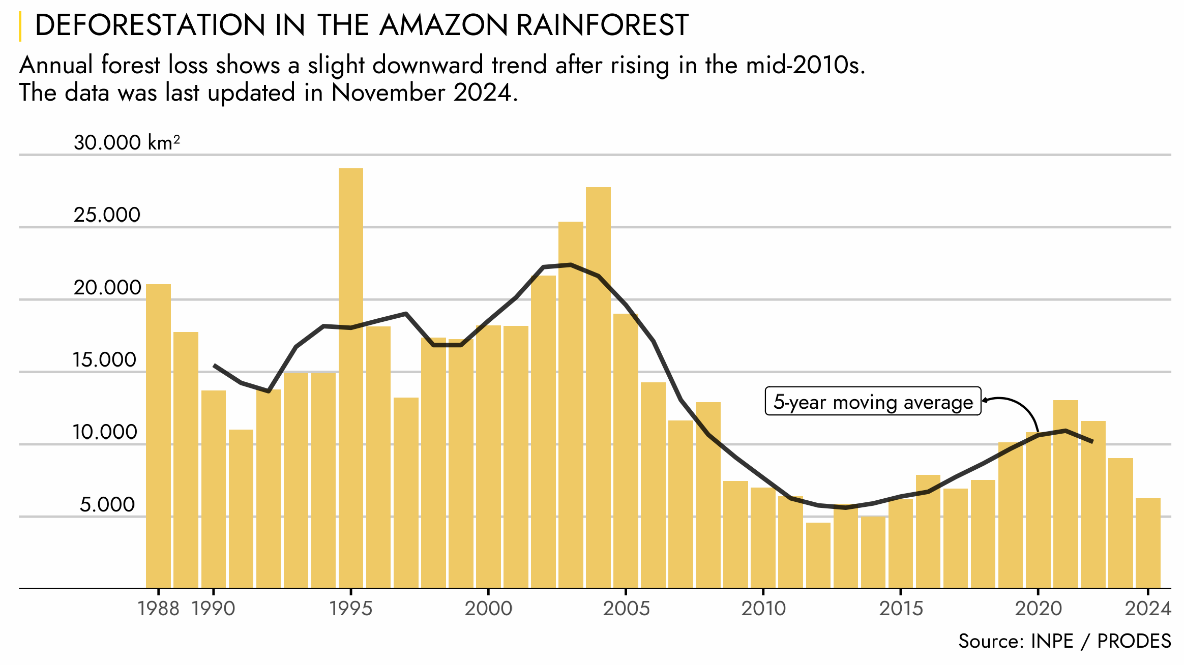
The #30DayChartChallenge is a community-driven data visualization initiative where participants create one chart a day for 30 days, following a prompt grouped into five weekly themes: Comparisons, Distributions, Relationships, Time Series, and Uncertainties. Source code on GitHub.