Code
library("readxl")
library("here")
library("ggplot2")
library("ggrepel")
library("dplyr")
library("reshape2")
library("kableExtra")Como desafio pessoal às vezes tento replicar gráficos que acho interessante. O portal Nexo, em particular, costuma ter lindas visualizações de dados. Vou tentar replicar os gráficos desta publicação. Como o foco desta postagem está na visualização e em mostrar exemplos de aplicações do ggplot2 vou omitir as (longas) manipulações de dados, deixando indicadas as fontes (com links) que usei. Numa postagem futura pretendo fazer um tutorial mais detalhado de como reproduzir estes gráficos.
library("readxl")
library("here")
library("ggplot2")
library("ggrepel")
library("dplyr")
library("reshape2")
library("kableExtra")Dados são do Maddison Project Database, disponíveis aqui
| País | Ano | Região | PIB | Crescimento |
|---|---|---|---|---|
| Angola | 2005 | Africa | 66351984 | 1 |
| Angola | 2011 | Africa | 123013536 | 1 |
| Albania | 2005 | Europe | 21452400 | 1 |
| Albania | 2006 | Europe | 22717995 | 1 |
| Albania | 2007 | Europe | 24080895 | 1 |
| Albania | 2008 | Europe | 25890410 | 1 |
| Albania | 2009 | Europe | 26754552 | 1 |
| Albania | 2010 | Europe | 27741824 | 1 |
| Albania | 2011 | Europe | 28452000 | 1 |
| Albania | 2012 | Europe | 28852736 | 1 |
Neste primeiro gráfico cada quadradinho representa uma variável binária que indica se o país estava em expansão ou recessão. Mapeio esta variável usando o geom_tile e depois ajusto o tamanho dos quadradinhos. Para dar um pouco da intuição do processo vale começar com uma versão simplificada do problema.
Queremos mapear a cada ano se um país está ou não em recessão. A tabela abaixo reúne esta informação para seis países (Alemanha, Bélgica, França, Itália, Polônia e Reino Unido) desde 1980. É um pequeno recorte da nossa base original.
| year | country | var_pib |
|---|---|---|
| 1980 | Belgium | 1 |
| 1980 | Germany | 1 |
| 1980 | France | 1 |
| 1980 | United Kingdom | 0 |
| 1980 | Italy | 1 |
| 1980 | Poland | 0 |
| 1981 | Belgium | 0 |
| 1981 | Germany | 1 |
| 1981 | France | 1 |
| 1981 | United Kingdom | 0 |
| 1981 | Italy | 1 |
| 1981 | Poland | 0 |
| 1982 | Belgium | 1 |
| 1982 | Germany | 0 |
| 1982 | France | 1 |
| 1982 | United Kingdom | 1 |
| 1982 | Italy | 1 |
| 1982 | Poland | 0 |
| 1983 | Belgium | 0 |
| 1983 | Germany | 1 |
| 1983 | France | 1 |
| 1983 | United Kingdom | 1 |
| 1983 | Italy | 1 |
| 1983 | Poland | 1 |
| 1984 | Belgium | 1 |
| 1984 | Germany | 1 |
| 1984 | France | 1 |
| 1984 | United Kingdom | 1 |
| 1984 | Italy | 1 |
| 1984 | Poland | 1 |
| 1985 | Belgium | 1 |
| 1985 | Germany | 1 |
| 1985 | France | 1 |
| 1985 | United Kingdom | 1 |
| 1985 | Italy | 1 |
| 1985 | Poland | 1 |
| 1986 | Belgium | 1 |
| 1986 | Germany | 1 |
| 1986 | France | 1 |
| 1986 | United Kingdom | 1 |
| 1986 | Italy | 1 |
| 1986 | Poland | 1 |
| 1987 | Belgium | 1 |
| 1987 | Germany | 1 |
| 1987 | France | 1 |
| 1987 | United Kingdom | 1 |
| 1987 | Italy | 1 |
| 1987 | Poland | 0 |
| 1988 | Belgium | 1 |
| 1988 | Germany | 1 |
| 1988 | France | 1 |
| 1988 | United Kingdom | 1 |
| 1988 | Italy | 1 |
| 1988 | Poland | 1 |
| 1989 | Belgium | 1 |
| 1989 | Germany | 1 |
| 1989 | France | 1 |
| 1989 | United Kingdom | 1 |
| 1989 | Italy | 1 |
| 1989 | Poland | 0 |
| 1990 | Belgium | 1 |
| 1990 | Germany | 0 |
| 1990 | France | 1 |
| 1990 | United Kingdom | 1 |
| 1990 | Italy | 1 |
| 1990 | Poland | 0 |
| 1991 | Belgium | 1 |
| 1991 | Germany | 1 |
| 1991 | France | 1 |
| 1991 | United Kingdom | 0 |
| 1991 | Italy | 1 |
| 1991 | Poland | 0 |
| 1992 | Belgium | 1 |
| 1992 | Germany | 1 |
| 1992 | France | 1 |
| 1992 | United Kingdom | 1 |
| 1992 | Italy | 1 |
| 1992 | Poland | 1 |
| 1993 | Belgium | 0 |
| 1993 | Germany | 0 |
| 1993 | France | 0 |
| 1993 | United Kingdom | 1 |
| 1993 | Italy | 0 |
| 1993 | Poland | 1 |
| 1994 | Belgium | 1 |
| 1994 | Germany | 1 |
| 1994 | France | 1 |
| 1994 | United Kingdom | 1 |
| 1994 | Italy | 1 |
| 1994 | Poland | 1 |
| 1995 | Belgium | 1 |
| 1995 | Germany | 1 |
| 1995 | France | 1 |
| 1995 | United Kingdom | 1 |
| 1995 | Italy | 1 |
| 1995 | Poland | 1 |
| 1996 | Belgium | 1 |
| 1996 | Germany | 1 |
| 1996 | France | 1 |
| 1996 | United Kingdom | 1 |
| 1996 | Italy | 1 |
| 1996 | Poland | 1 |
| 1997 | Belgium | 1 |
| 1997 | Germany | 1 |
| 1997 | France | 1 |
| 1997 | United Kingdom | 1 |
| 1997 | Italy | 1 |
| 1997 | Poland | 1 |
| 1998 | Belgium | 1 |
| 1998 | Germany | 1 |
| 1998 | France | 1 |
| 1998 | United Kingdom | 1 |
| 1998 | Italy | 1 |
| 1998 | Poland | 1 |
| 1999 | Belgium | 1 |
| 1999 | Germany | 1 |
| 1999 | France | 1 |
| 1999 | United Kingdom | 1 |
| 1999 | Italy | 1 |
| 1999 | Poland | 1 |
| 2000 | Belgium | 1 |
| 2000 | Germany | 1 |
| 2000 | France | 1 |
| 2000 | United Kingdom | 1 |
| 2000 | Italy | 1 |
| 2000 | Poland | 1 |
| 2001 | Belgium | 1 |
| 2001 | Germany | 1 |
| 2001 | France | 1 |
| 2001 | United Kingdom | 1 |
| 2001 | Italy | 1 |
| 2001 | Poland | 1 |
| 2002 | Belgium | 1 |
| 2002 | Germany | 1 |
| 2002 | France | 1 |
| 2002 | United Kingdom | 1 |
| 2002 | Italy | 1 |
| 2002 | Poland | 1 |
| 2003 | Belgium | 1 |
| 2003 | Germany | 0 |
| 2003 | France | 1 |
| 2003 | United Kingdom | 1 |
| 2003 | Italy | 1 |
| 2003 | Poland | 1 |
| 2004 | Belgium | 1 |
| 2004 | Germany | 1 |
| 2004 | France | 1 |
| 2004 | United Kingdom | 1 |
| 2004 | Italy | 1 |
| 2004 | Poland | 1 |
| 2005 | Belgium | 1 |
| 2005 | Germany | 1 |
| 2005 | France | 1 |
| 2005 | United Kingdom | 1 |
| 2005 | Italy | 1 |
| 2005 | Poland | 1 |
| 2006 | Belgium | 1 |
| 2006 | Germany | 1 |
| 2006 | France | 1 |
| 2006 | United Kingdom | 1 |
| 2006 | Italy | 1 |
| 2006 | Poland | 1 |
| 2007 | Belgium | 1 |
| 2007 | Germany | 1 |
| 2007 | France | 1 |
| 2007 | United Kingdom | 1 |
| 2007 | Italy | 1 |
| 2007 | Poland | 1 |
| 2008 | Belgium | 1 |
| 2008 | Germany | 1 |
| 2008 | France | 1 |
| 2008 | United Kingdom | 0 |
| 2008 | Italy | 0 |
| 2008 | Poland | 1 |
| 2009 | Belgium | 0 |
| 2009 | Germany | 0 |
| 2009 | France | 0 |
| 2009 | United Kingdom | 0 |
| 2009 | Italy | 0 |
| 2009 | Poland | 1 |
| 2010 | Belgium | 1 |
| 2010 | Germany | 1 |
| 2010 | France | 1 |
| 2010 | United Kingdom | 1 |
| 2010 | Italy | 1 |
| 2010 | Poland | 1 |
| 2011 | Belgium | 1 |
| 2011 | Germany | 1 |
| 2011 | France | 1 |
| 2011 | United Kingdom | 1 |
| 2011 | Italy | 1 |
| 2011 | Poland | 1 |
| 2012 | Belgium | 1 |
| 2012 | Germany | 1 |
| 2012 | France | 1 |
| 2012 | United Kingdom | 1 |
| 2012 | Italy | 0 |
| 2012 | Poland | 1 |
| 2013 | Belgium | 0 |
| 2013 | Germany | 1 |
| 2013 | France | 1 |
| 2013 | United Kingdom | 1 |
| 2013 | Italy | 0 |
| 2013 | Poland | 1 |
| 2014 | Belgium | 1 |
| 2014 | Germany | 1 |
| 2014 | France | 1 |
| 2014 | United Kingdom | 1 |
| 2014 | Italy | 1 |
| 2014 | Poland | 1 |
| 2015 | Belgium | 1 |
| 2015 | Germany | 1 |
| 2015 | France | 1 |
| 2015 | United Kingdom | 1 |
| 2015 | Italy | 1 |
| 2015 | Poland | 1 |
| 2016 | Belgium | 1 |
| 2016 | Germany | 1 |
| 2016 | France | 1 |
| 2016 | United Kingdom | 1 |
| 2016 | Italy | 1 |
| 2016 | Poland | 1 |
A função geom_tile() mapeia cada observação num quadrado. A cor de cada quadrado depende da variável binária var_pib. O código abaixo mostra como montar este gráfico bastante simples.
ggplot(sub, aes(x = year, y = country)) +
  geom_tile(aes(fill = var_pib), height = .85, width = 1)
O resto do trabalho é simplesmente ajustar os eixos, os nomes das legendas, etc. No código fonte da página do Nexo encontrei as fontes usadas nos gráficos: Gotham Rounded Bold e Gotham Rounded Light. O pacote showtext me permite carregar estas fontes no R.
O gráfico abaixo mostra o resultado final considerando todos os países da Europa.
d_europa <- d %>%
  # Filtra por região (Europa)
  filter(region == "Europe") %>%
  # Restringe a amostra às observações a partir de 1900
  filter(year >= 1900)

plot_europa <- ggplot(d_europa, aes(year, country))+
  # Mapeia cada variável como um 'tile' (quadradinho)
  geom_tile(aes(fill = var_pib), height = .85, width = 1)+
  # Superimpõe linhas verticais tracejadas
  geom_vline(
    # valores de corte das linhas
    xintercept = c(1900, 1925, 1950, 1975, 2000, 2016),
    # tipo da linha (2 = tracejado)
    linetype = 2,
    # cor da linha
    colour = "gray65"
    )+
  # Modifica o eixo-x
  scale_x_continuous(
    breaks = c(1900, 1925, 1950, 1975, 2000, 2016),
    # remove a área entre o gráfico e o eixo
    expand = c(0,0),
    # duplica o eixo (para aparecer em cima e em baixo)
    sec.axis = dup_axis()
    ) +
  # Modifica a legenda e as cores
  scale_fill_discrete(
    breaks = c(0,1),
    # título da legenda
    name = "VARIAÇÃO DO PIB NO MUNDO\nPor ano",
    # texto da legenda
    labels = c("PIB EM QUEDA", "PIB EM CRESCIMENTO"),
    na.value = "gray90"
    )+
  # Define o título do gráfico e o título dos eixos
  labs(title = "Europa", x = NULL, y = NULL)+
  # Modifica características estéticas do gráfico
  theme(
    # Fundo do gráfico
    panel.grid = element_blank(),
    # Define as margens do gráfico
    plot.margin = unit(c(1, 1, .5, 1), "cm"),
    # Eixos
    axis.text.y = element_text(vjust = .4),
    axis.ticks = element_line(size = .4),
    axis.text = element_text(family  = "Gotham Rounded Light", size = 8),
    # Legenda
    legend.position = "top",
    legend.text = element_text(
      size = 8,
      colour = "gray20",
      family = "Gotham Rounded Bold"
      ),
    legend.title = element_text(
      size = 12,
      colour = "gray20",
      family = "Gotham Rounded Bold"
      ),
    # Título
    plot.title = element_text(family = "Crimson Text", size = 18)
    )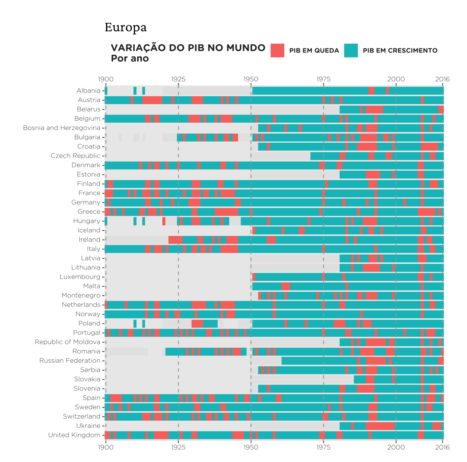
Para fazer o mesmo gráfico para os países da América do Sul e da Ásia basta filtrar por estas regiões. Esta é uma das grandes vantagens do R: para fazer os dois gráficos abaixo só precisei mudar uma linha de código. Na verdade, como é uma mudança muito simples podemos montar o processo acima numa função que cria exatamente o mapa acima para cada região.
O código abaixo mostra um exemplo de como estruturar isto.
# Função para reproduzir o gráfico acima

# Guarda as informações do tema
theme_vini <-
  theme(
    # Fundo do gráfico
    panel.grid = element_blank(),
    # Define as margens do gráfico
    plot.margin = unit(c(1, 1, .5, 1), "cm"),
    # Eixos
    axis.text.y = element_text(vjust = .4),
    axis.ticks = element_line(size = .4),
    axis.text = element_text(family  = "Gotham Rounded Light", size = 8),
    # Legenda
    legend.position = "top",
    legend.text = element_text(
      size = 8,
      colour = "gray20",
      family = "Gotham Rounded Bold"
      ),
    legend.title = element_text(
      size = 12,
      colour = "gray20",
      family = "Gotham Rounded Bold"
      ),
    # Título
    plot.title = element_text(family = "Crimson Text", size = 18)
    )

# Função simples para traduzir os títulos
translate_region <- function(string) {

  vl <- c(
    "South America" = "América do Sul",
    "Asia" = "Ásia",
    "Africa" = "África",
    "Oceania" = "Oceania",
    "North America" = "América do Norte",
    "Latin America And The Caribbean" = "América Latina",
    "Europa" = "Europa"
    )

  return(unname(vl[string]))

}

plot_regiao <- function(name_region) {

  # Filtra por região e restringe a amostra às observações a partir de 1900

  if (name_region == "South America") {

    df <- dplyr::filter(d, subregion == name_region, year >= 1900)

  } else {

    df <- dplyr::filter(d, region == name_region, year >= 1900)
  }

  p <-
    ggplot(df, aes(year, country)) +
    geom_tile(aes(fill = var_pib), height = .85, width = 1) +
    geom_vline(
      xintercept = c(1900, 1925, 1950, 1975, 2000, 2016),
      linetype = 2,
      colour = "gray65"
      ) +
    scale_x_continuous(
      breaks = c(1900, 1925, 1950, 1975, 2000, 2016),
      expand = c(0,0),
      sec.axis = dup_axis()
      ) +
    scale_fill_discrete(
      breaks = c(0,1),
      name = "VARIAÇÃO DO PIB NO MUNDO\nPor ano",
      labels = c("PIB EM QUEDA", "PIB EM CRESCIMENTO"),
      na.value = "gray90"
      ) +
    labs(title = translate_region(name_region), x = NULL, y = NULL) +
    theme_vini

  return(p)

}

plot_regiao("South America")
plot_regiao("Asia") 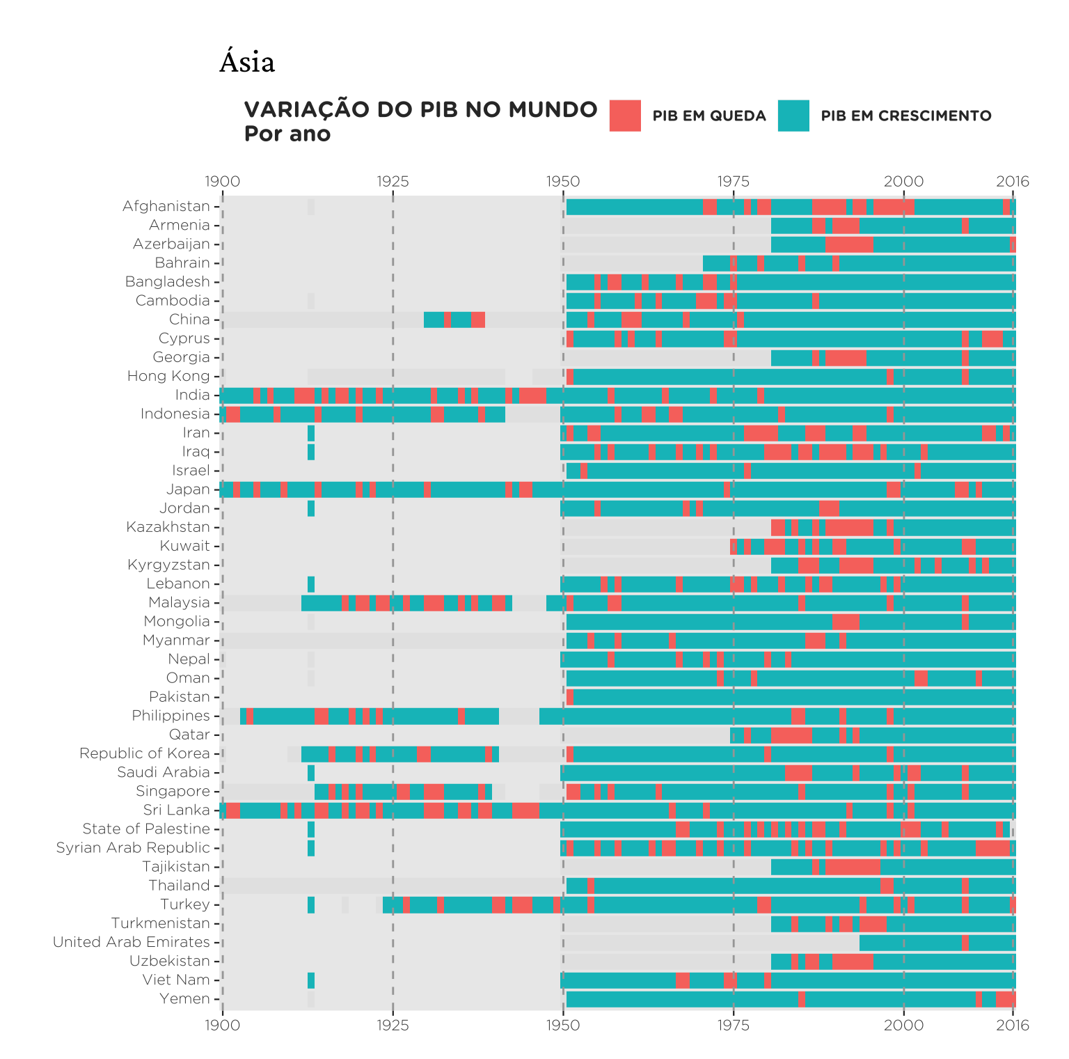
plot_regiao("Latin America And The Caribbean")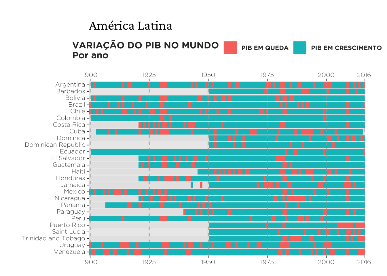
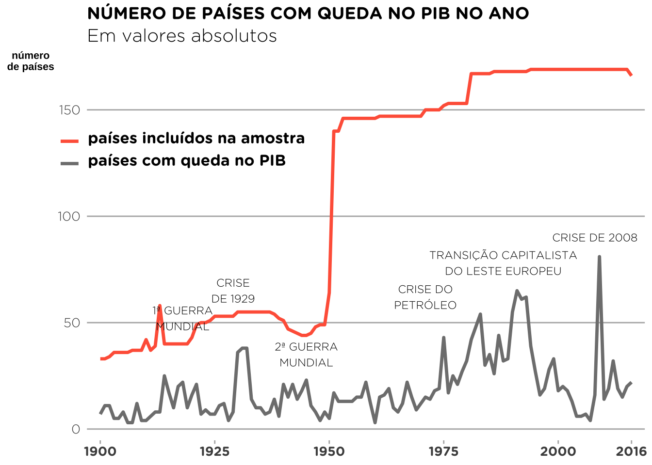
Este gráfico conta o número absoluto de países que estava em recessão durante um determinado ano. Como o número de países dentro da amostra também cresce com o tempo, uma linha cinza foi adicionada para representar isto. Resolvi suprimir as flechas que aparecem na postagem original, pois a implementação disto no ggplot é muito trabalhosa e o resultado final não é tão bonito.
# Primeiro: conta o número de países pela variável var_pib
# (1 = expansão, 0 = recessão)
recession_countries <- d %>%
  # Seleciona as observações a partir de 1900
  filter(year >= 1900) %>%
  # Agrupa os dados por ano e var_pib
  group_by(year, var_pib) %>%
  # Soma os valores que não são NA por tipo (1 = expansão, 0 = recessão)
  summarise(tipo = sum(!is.na(var_pib)))

# Segundo: conta o número de países incluídos na amostra
recession_countries <- recession_countries %>%
  group_by(year) %>%
  mutate(amostra = sum(tipo)) %>%
  ungroup()

# Terceiro: remove as contagens de anos de expansão e converte os dados para longitudinal (melhor para plotar)
recession_countries <- recession_countries %>%
  # Remove os valores que são referentes a anos de expansão
  filter(var_pib != 1) %>%
  # Tranforma os dados em longitudinais por ano e 'var_pib'
  # (tipo = recessão, amostra = observações válidas)
  melt(id.vars = c("year", "var_pib"))

# Base de dados para os textos no gráfico
highlight <- data.frame(
  evento = c(
    "1ª GUERRA\nMUNDIAL", "CRISE\nDE 1929", "2ª GUERRA\nMUNDIAL",
    "CRISE DO\nPETRÓLEO", "TRANSIÇÃO CAPITALISTA\nDO LESTE EUROPEU",
    "CRISE DE 2008"),
  year = c(1918, 1929, 1945, 1971, 1988, 2008),
  y = c(52, 65, 35, 62, 78, 90)
)# Obs: como plotamos dados de duas bases diferentes a sintaxe é diferente
ggplot() +
geom_line(
data = recession_countries,
aes(year, value, group = variable, colour = variable),
# Espessura da linha
linewidth = 1.2
) +
# Destaques de texto
geom_text(
data = highlight,
aes(year, y, label = evento),
size = 3,
family = "Gotham Rounded Light",
vjust = "center",
hjust = "center") +
# Troca as cores das linhas e altera a legenda
scale_colour_manual(
name = NULL,
breaks = c("amostra", "tipo"),
values = c("tomato", "gray50"),
labels = c("países incluídos na amostra", "países com queda no PIB")
) +
scale_x_continuous(
breaks = c(1900, 1925, 1950, 1975, 2000, 2016),
expand = c(0.025,0.025)
) +
# Define o título e subtítulo do gráfico e o título dos eixos
labs(
x = NULL,
y = "número\nde países",
title = "NÚMERO DE PAÍSES COM QUEDA NO PIB NO ANO",
subtitle = "Em valores absolutos"
) +
theme(
# Título e subtítulo
plot.title = element_text(family = "Gotham Rounded Bold"),
plot.subtitle = element_text(family = "Gotham Rounded Light", size = 14),
# Eixos
axis.text.x = element_text(family = "Gotham Rounded Bold", size = 10),
axis.text.y = element_text(family = "Gotham Rounded Light", size = 10),
axis.ticks.x = element_line(colour = "grey70"),
axis.ticks.y = element_blank(),
axis.title.y = element_text(angle = 360, face = "bold", size = 8),
# Legenda
legend.text = element_text(
family = "Gotham Rounded Bold",
size = 12,
vjust = .8,
hjust = 0
),
legend.background = element_rect(fill = NA),
legend.key = element_rect(fill = "white"),
legend.position = c(0.17,0.75),
# Fundo do gráfico
panel.background = element_rect(fill = "white"),
# Linhas de grade
panel.grid = element_blank(),
panel.grid.major.y = element_line(colour = "grey70")
)
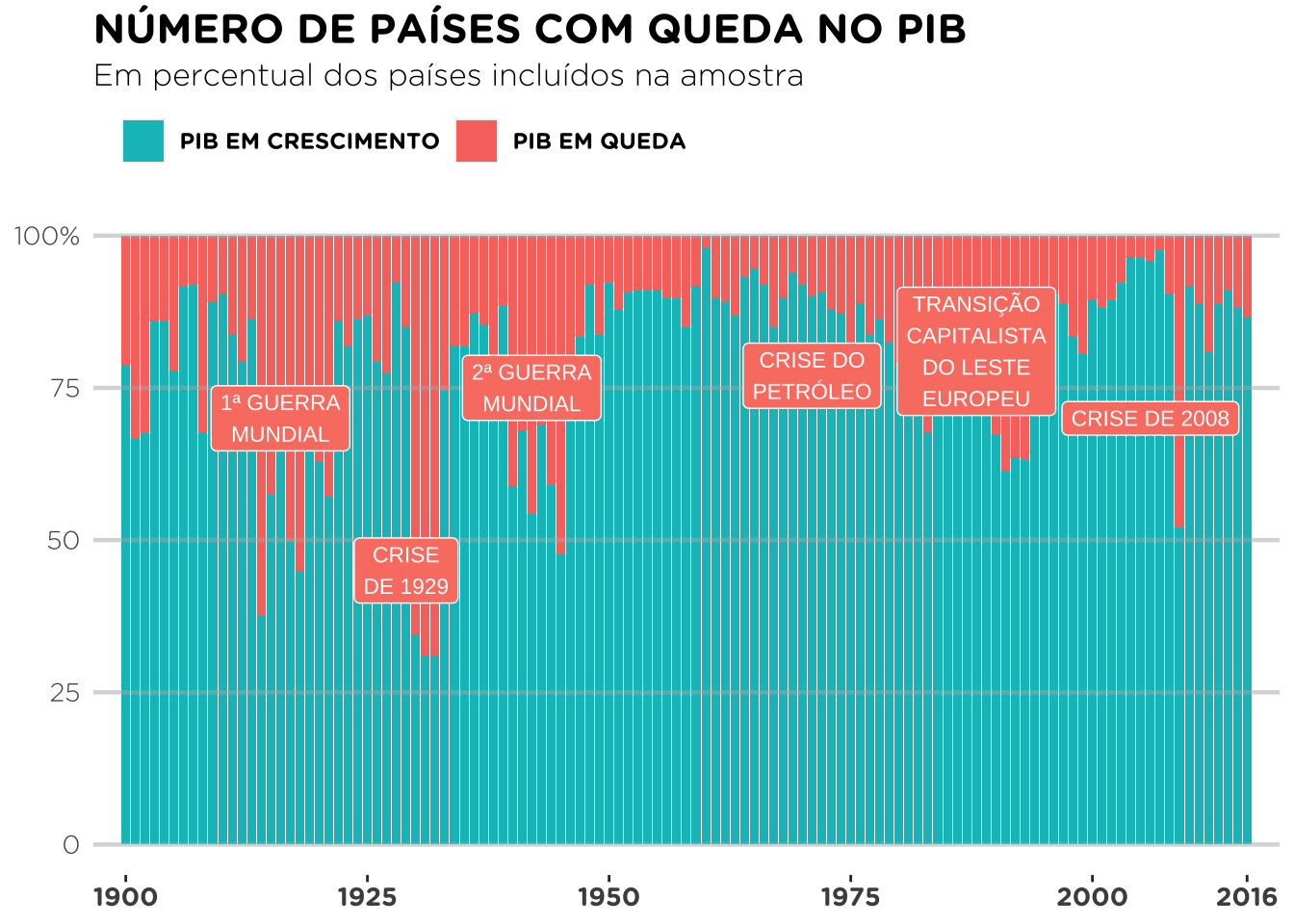
Este último gráfico mostra o número relativo de países em recessão.
# Calcula o share de países em recessão na amostra a cada ano
share_recession <- d %>%
  filter(year >= 1900) %>%
  # Agrupa os dados por ano e var_pib (indicadora)
  group_by(year, var_pib) %>%
  # Remove as observações ausentes
  filter(!is.na(var_pib)) %>%
  # Conta o número de casos
  summarise(count = n()) %>%
  # Calcula a proporção dos casos acima (em porcentagem)
  group_by(year) %>%
  mutate(freq = count / sum(count) * 100)

# Tabela auxiliar para guardar os valores que vão ser plotados como
# texto no gráfico
highlight <- data.frame(
  evento = c(
    "1ª GUERRA\nMUNDIAL", "CRISE\nDE 1929", "2ª GUERRA\nMUNDIAL",
    "CRISE DO\nPETRÓLEO", "TRANSIÇÃO\nCAPITALISTA\nDO LESTE\nEUROPEU",
    "CRISE DE 2008"),
  year = c(1916, 1929, 1942, 1971, 1988, 2006),
  y = c(70, 45, 75, 77, 81, 70)
)ggplot() +
geom_col(data = share_recession, aes(year, freq, fill = var_pib)) +
# Superimpõe linhas horizontais no gráfico
geom_hline(
yintercept = seq(0, 100, 25),
colour = "gray70",
alpha = .5,
size = .8
) +
# Mapeia o texto no gráfico (geom_label permite escolher fill = "salmon")
geom_label(
data = highlight,
aes(year, y, label = evento),
colour = "white",
size = 3,
fill = "salmon",
family = "Gotham Rounded Medium")+
# Define título, subtítulo e o título dos eixos
labs(
x = NULL,
y = NULL,
title = "NÚMERO DE PAÍSES COM QUEDA NO PIB",
subtitle = "Em percentual dos países incluídos na amostra")+
scale_fill_discrete(
name = NULL,
breaks = c(1,0),
labels = c("PIB EM CRESCIMENTO", "PIB EM QUEDA"))+
scale_x_continuous(
breaks = c(1900, 1925, 1950, 1975, 2000, 2016),
expand = c(0.025,0.025)
) +
scale_y_continuous(
breaks = seq(0, 100, 25),
labels = c(0, 25, 50, 75, "100%")
)+
theme(
# Fundo do gráfico
panel.background = element_rect(fill = "white"),
# Linhas de grade
panel.grid = element_blank(),
# Legenda
legend.position = "top",
legend.direction = "horizontal",
legend.justification='left',
legend.text = element_text(family = "Gotham Rounded Bold"),
# Título e subtítulo
plot.title = element_text(family = "Gotham Rounded Bold", size = 16),
plot.subtitle = element_text(family = "Gotham Rounded Light", size = 12),
# Eixos
axis.text.x = element_text(family = "Gotham Rounded Bold", size = 10),
axis.text.y = element_text(family = "Gotham Rounded Light", size = 10),
axis.ticks.y = element_blank()
)
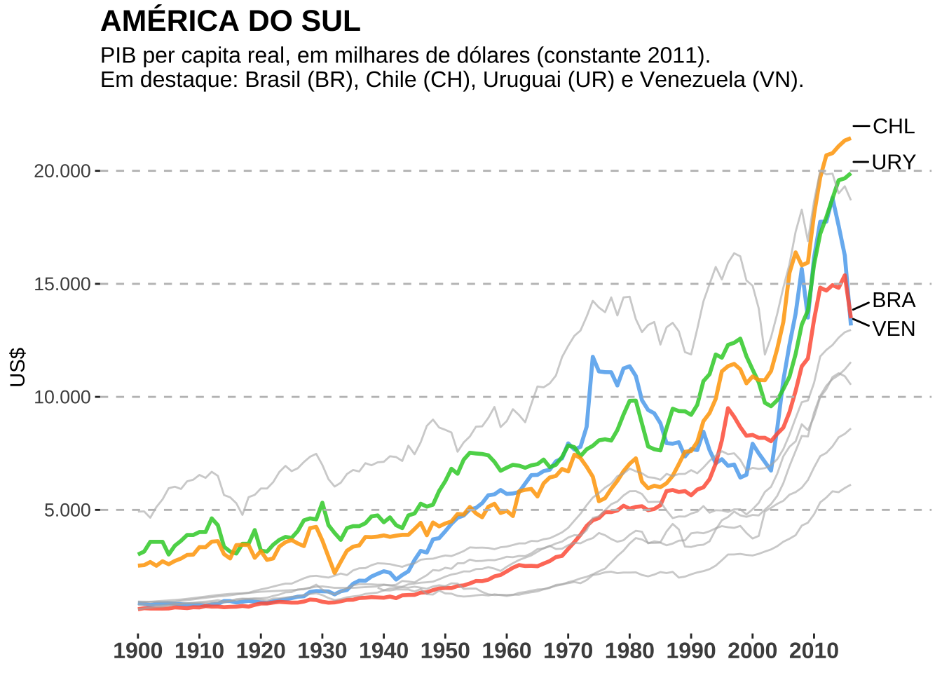
Resolvi fazer um gráfico próprio mostrando o crescimento do PIB nos países da América Latina dando destaque para alguns.
destaque <- c("Uruguay", "Brazil", "Chile", "Venezuela")

principal <- d %>%
  filter(year >= 1900, subregion == "South America") %>%
  mutate(ind = as.factor(ifelse(country %in% destaque, country, NA))) %>%
  filter(!is.na(ind))

outros <- d %>%
  filter(year >= 1900, subregion == "South America") %>%
  mutate(ind = as.factor(ifelse(country %in% destaque, NA, country))) %>%
  filter(!is.na(ind))

y <- principal %>%
  filter(year == 2016) %>%
  mutate(
    y = cgdppc,
    country_abbrev = case_when(
      country == "Brazil" ~ "BRA",
      country == "Venezuela" ~ "VEN",
      country == "Uruguay" ~ "URY",
      country == "Chile" ~ "CHL",
      TRUE ~ country
))ggplot() +
geom_line(
data = principal,
aes(year, cgdppc, group = country, colour = ind),
linewidth = 1,
alpha = .85
) +
geom_line(
data = outros,
aes(year, cgdppc, group = country),
colour = "grey70",
alpha = .6
) +
geom_hline(
yintercept = seq(5000, 20000, 5000),
linetype = 2,
colour = "grey75"
) +
geom_text_repel(
data = y,
aes(year, cgdppc * 1.025, label = country_abbrev),
size = 4,
family = "Bahnschrift",
colour = "black", nudge_x = 7, force = 5
) +
scale_colour_manual(
values = c("steelblue2", "limegreen", "orange", "tomato")
)+
scale_x_continuous(breaks = c(seq(1900, 2010, 10)))+
scale_y_continuous(
breaks = seq(5000, 20000, 5000),
labels = c("5.000", "10.000", "15.000", "20.000")
)+
guides(colour = FALSE)+
labs(
x = NULL,
y = "US$",
title = "AMÉRICA DO SUL",
subtitle = "PIB per capita real, em milhares de dólares (constante 2011).\nEm destaque: Brasil (BR), Chile (CH), Uruguai (UR) e Venezuela (VN).")+
theme(
text = element_text(family = "Bahnschrift"),
panel.background = element_rect(fill = "white"),
axis.text.x = element_text(face = "bold", size = 12),
axis.text.y = element_text(size = 10),
plot.title = element_text(size = 16, face = "bold"),
plot.subtitle = element_text(size = 12)
)